Showing posts with label design. Show all posts

Monday, March 27, 2017

Logo 4: The Linkin Park Logo


The Linkin Park logo since 2002
The next logo I will be covering is of the widely popular industrial-rock, nu metal band Linkin Park. While I am not the biggest fan of their music, they have one of the most creative and interesting logos out of many rock bands today.
Linkin Park's original logo in 2000
Linkin Park was founded in 1996 by Mike Shinoda, Rob Bourdon, and Brad Delson. They named the band that name as a homage to Lincoln Park, Santa Monica.
 They have met a large amount of success in the form of diamond certification by the Recording Industry Association of America, topping the billboard charts, millions of album sales worldwide and spearheading the nu-metal genre.
File:Chester-shinosa-montreal-2014.jpg
Chester Bennington and Mike Shinoda performing live in Montreal 2014
(photo credit to Kristina Servant)
Now for the logo. This logo is perfect for this band because it’s exactly the kind of logo you’d expect after listening their music. It’s simple, symmetrical and marketable. It’s a logo that would look great on a t-shirt.
It makes the use of one continuous line drawing a circle and the group’s initials “LP”. The logo is usually white on a black background. This color scheme and design compliments the band’s aggressive, heavy metal sound.

Linkin Park's most recent logo 
This logo is very noteworthy and should be regarded as one of the most iconic band logos of all time. A more recent take on the logo was created that has a hexagon shape instead of a circle to represent the band’s six members.

Sources:
Google Images

Wednesday, March 22, 2017

Logo 3: The Razer Triple-Headed Snake

The next logo we will be looking at is one of the most popular and successful gaming brands, Razer. While this logo isn’t as widely well-known as Twitter or Chevrolet, but it still has a strong following consisting of gamers, or even PC users.

Razer is a company that produces PC peripherals and merchandise. The brand is particularly popular because its target demographic is gamers, specifically PC users.
The Razer Naga Chroma Gaming Mouse
The Razer Deathstalker Gaming Keyboard

Their business model frequently promotes professional gaming and Esports. They market the members or partners of the brand as “Pro-gaming elite”. The gaming market nowadays is thriving, as well as Esports; which has millions of fans and followers throughout many games, such as Counter-Strike: Global Offensive, FIFA and League of Legends.
Team Razer promotes professional gamers 

I personally use multiple Razer products, and they are top of the line. They are comfortable and near essential for gaming, they will also function well in general.
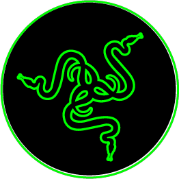
Now for the logo itself. I must say it is a very creative logo. The design is very sleek and cutting-edge, just like their products. The design is built on an illustration of a snake that is copied and rotated to create somewhat of a kaleidoscopic design.
Snakes are attributed with danger or aggression. Which compliments their business model of being the best at whatever game the customer’s playing.

The color scheme also agrees with this quality. It’s colored green, which is the color of victory and it’s usually placed on a solid black background which makes the green pop out almost in a glowing-like fashion.

Sources:
Google Images

Tuesday, March 14, 2017

Logo 1: The Twitter Bird


Twitter's first logo in 2006
Twitter's second logo in 2010
https://g.twimg.com/about/feature-corporate/image/twitterbird_RGB.png
Twitter redesigns their logo in 2012 


Twitter as we all know is a widely used social media platform. It has millions of users posting text, images, videos daily. Overall, the company is very successful and their brand is very recognizable by thousands and thousands of people worldwide. Twitter for me personally is an app that I spend a lot of time on. When I'm on my PC I always have twitter open in a browser tab and I frequently refresh it to see the new tweets. 
What I will be focusing on right now is the ingenious design behind the familiar twitter bird we all know.  The logo has gone through different iterations. It started as just being the word "twitter" in a unique, light blue font. Then they changed the font to black and added a blue bird icon to the right. 
By 2012, twitter has become popular enough to no longer need the text. So they redesigned the bird, gave it a slightly darker color and made it bigger. 
While I think the previous logo was solid, this one was the right move for the company to make, because of how beautifully it strikes you and how memorable it is. 
One basic design element it nails is the use of color. Aside from the fact that this shade of blue is twitter's official color, it is a strong color when it comes to marketing. 
Blue is a cool color. Which means when someone looks at the strong, vibrant color, it puts them at ease. 
Blue is associated with soft, relaxing things such as the ocean, or the sky. In this case, twitter is about connectivity, and bringing people together, bringing an overall sense of union between people from all over the world.


 https://pbs.twimg.com/profile_images/2864678434/aa77103728910e2640fe386dad125431_400x400.jpeg
http://www.underconsideration.com/brandnew/archives/att_2016_logo_with_type.pngExamples of logos which use the same color scheme.

Sources: